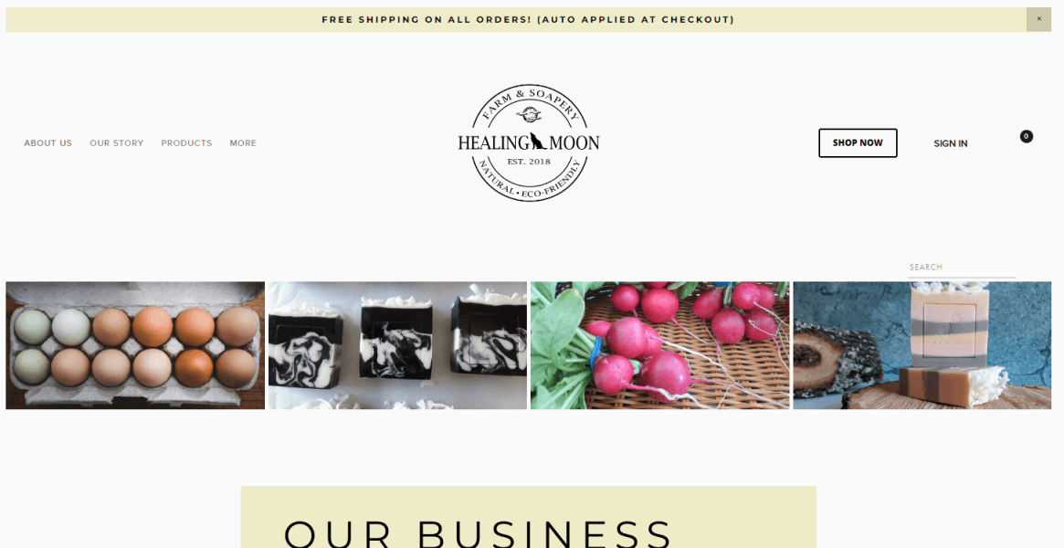
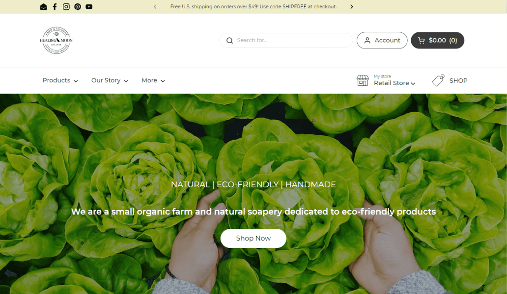
As a small business their main goal was to increase site views, leads and sales.
My goal was to improve site readability and address any UI improvements to create an easier experience for their users. After reviewing web analytics data, I also wanted to improve lead generation by redesigning the newsletter signup CTA, A/B testing marketing emails, and improving dissemination of product value information on site.
Their users expressed some pain points on the site via email feedback. Here were the top the pain points:
Confusing homepage, a lot to look at or scroll through.
Where is my account?
Hard to search for products.
Homepage information architecture can be adjusted to help with the scrolling. The search and account buttons need to become the focus in the header for users, providing intuitive search functionality to help users find what they are looking for.
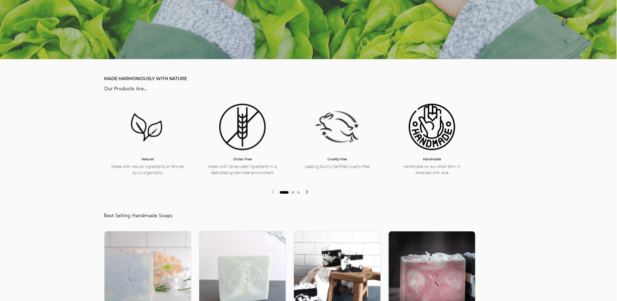
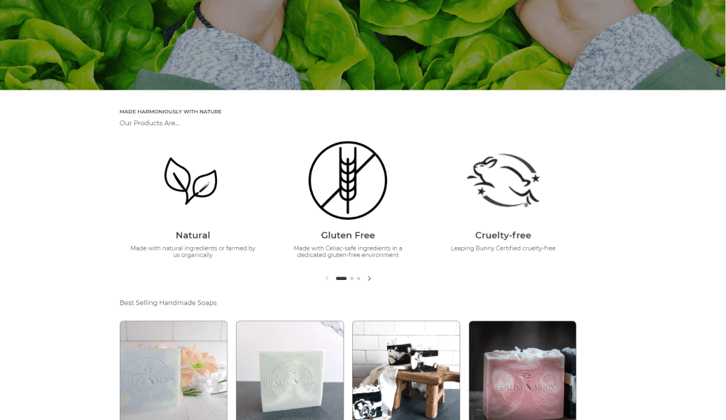
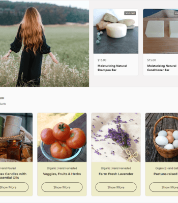
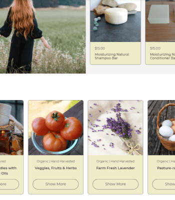
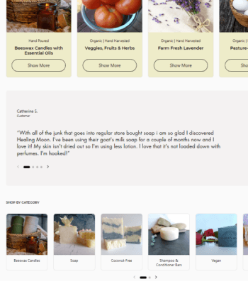
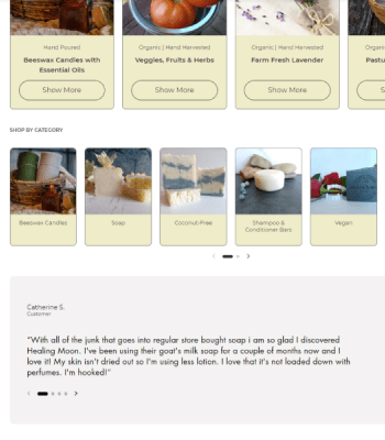
The four banner images stacked non uniformly on mobile devices and layout was not mobile optimized. Analytics showed 80% of users visit the site on a mobile device.
I added a clear account login CTA and search bar functionality. The cart contents are clearly displayed as a user moves through the Consideration to Purchase stages of the user buying journey.
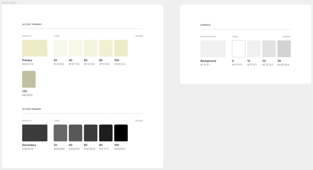
I created their backend colors and typography to match their brand design.
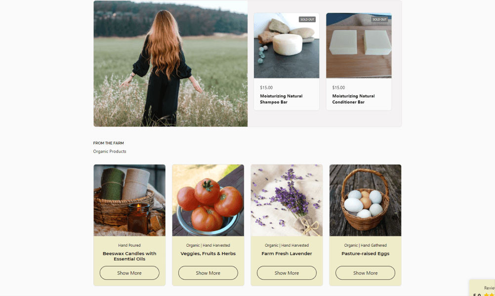
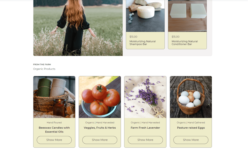
Site was not consistent with the branded colors. Text readability was compromised in areas and impacted accessibility for users with disabilities
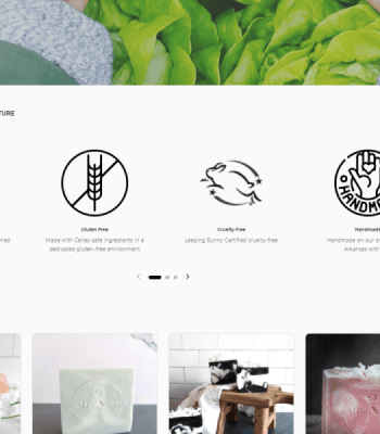
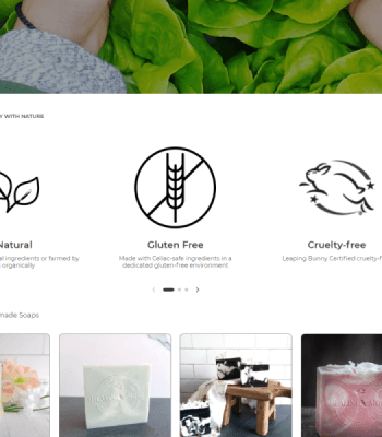
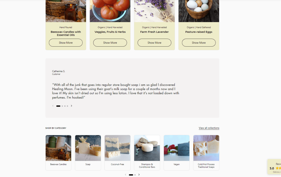
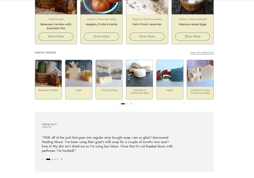
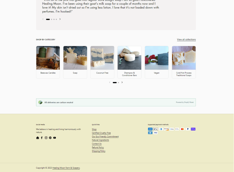
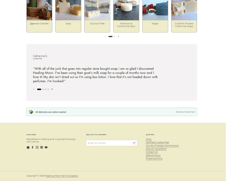
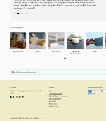
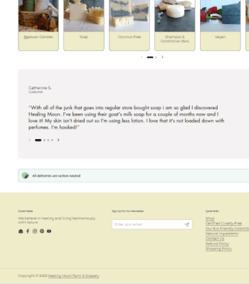
The homepage needed a few minor adjustments to the layout in order to keep the consistency I was going for in the design. Below is a screen shot at the bottom of the page.
We brainstormed on what the footer would include and based on web analytics data, the team decided to add a newsletter option to improve lead generation as well as remove the supported payments section. We also removed unnecessary links that appeared overwhelming for the user.
The value of user feedback that contributes to design ideas.
Building designs around the user organically aligns with the business goals.
Staying within the scope of the problem space in the design.
The next step for this project is usability testing on the homepage and then a redesign based on feedback from the testing.


