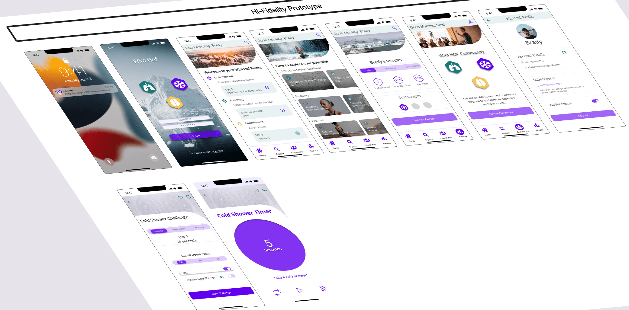
The Wim Hof app is overwhelming for new users, with too many options for them to start their cold water habit. Our task was to make it easy for new users to customize, complete and track their cold shower challenge.
The solution we came up with after initial user testing was restructuring the layout of the UI. We relocated and organized educational information to ensure efficiency for new users. By making the cold shower challenge smooth and user friendly, by removing pop up educational screens; testing has shown an improvement on efficiency and overall satisfaction using the Wim Hof app.
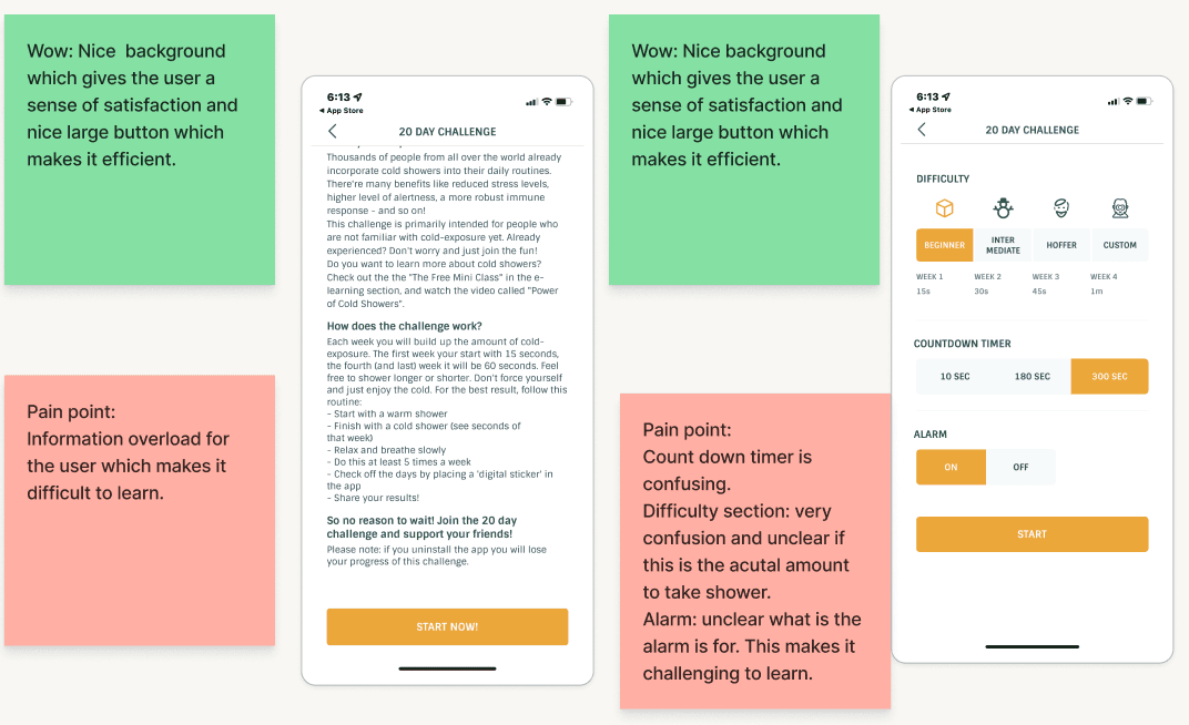
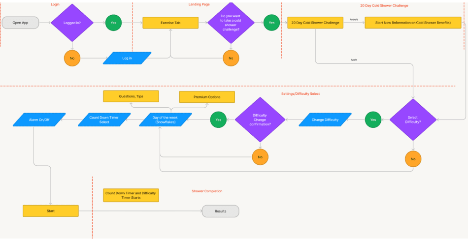
Our initial review of the Wim Hof app 20 Day Cold Shower challenge found information overload. Too many screens and options felt like a road block for me as a user wanting to try the cold shower challenge.
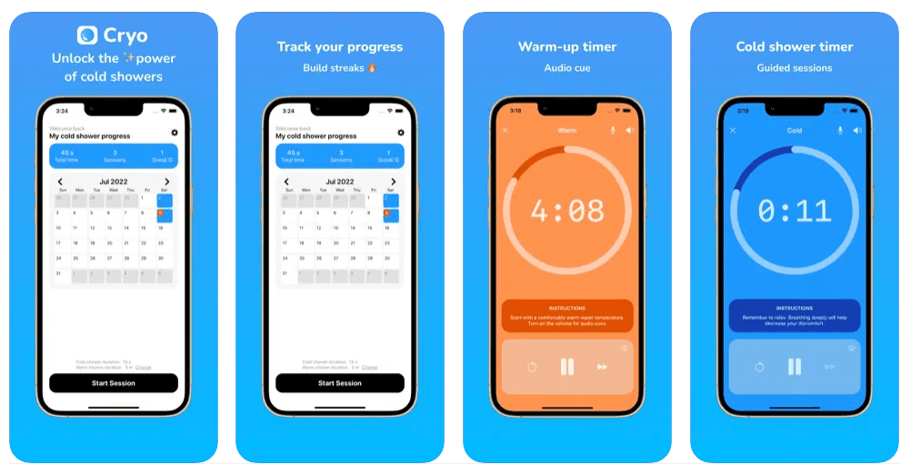
Cryo - Cold Shower
This competitor helps new and returning users by making cold showers a habit with a progress-based routine in a simple and easy to use design.
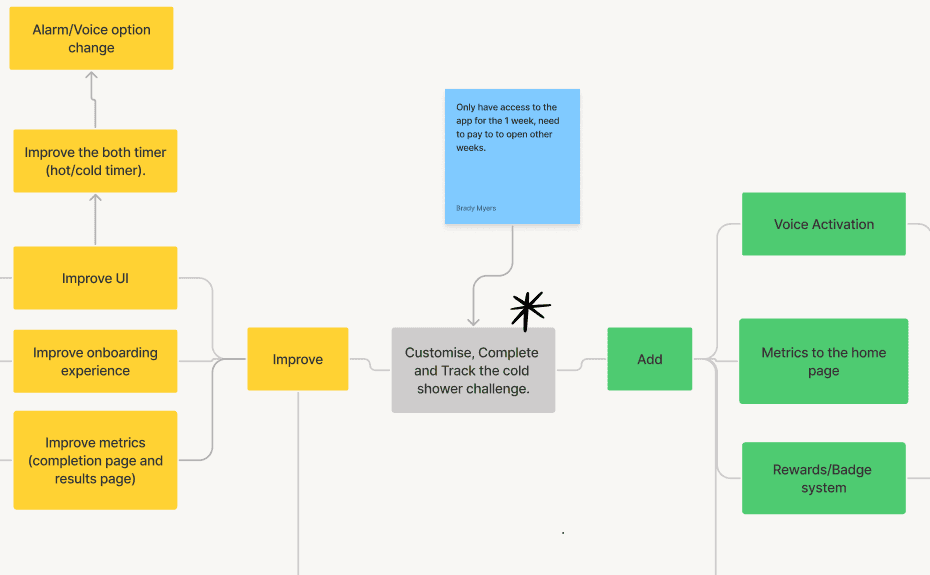
In this phase we used mind mapping to generate ideas and get everything we could think of written down. In the second phase we developed our design ideas using the crazy 8's Method. In the final phase we used a priority matrix to look at what our higher priority ideas where.
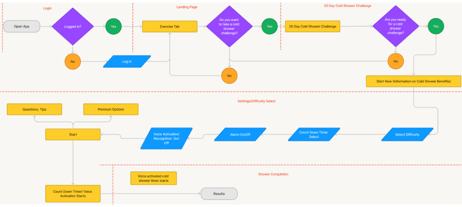
After developing the original user flow, we recognized a high amount of decisions required of the user while trying to do the cold shower challenge. We trimmed those pesky pop ups full of educational information.
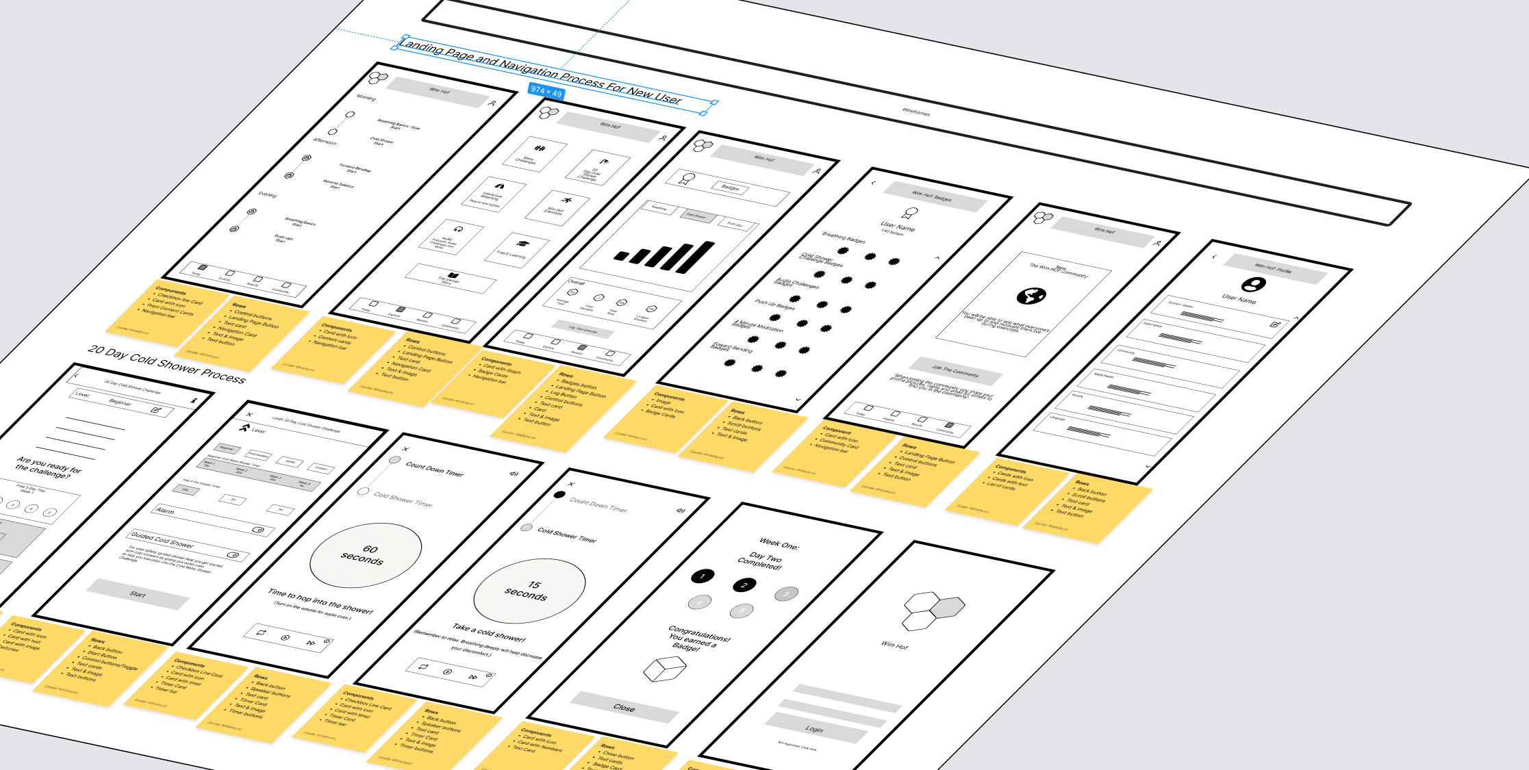
Putting our ideas together and in a rough wireframe allowed us to gain more insight on what design choices worked and what didn't.
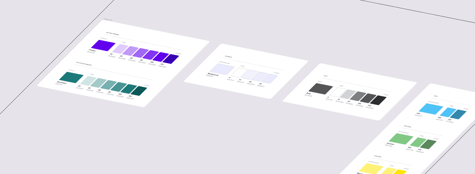
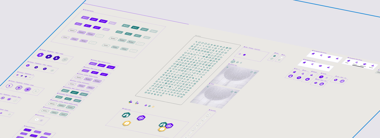
We created more components than we ended up using in our hi-fidelity prototype, but it allowed for us as designers to plug and play with different design choices based on feedback.
Our final prototype came out better than we originally thought. We found that simplicity and not over complicating the design lead to a more enjoyable user experience.
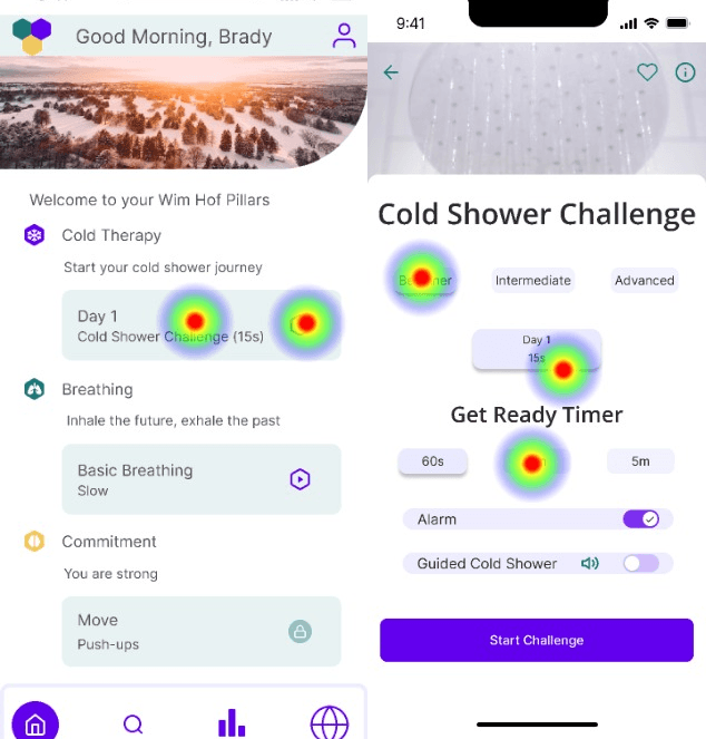
We used Maze as our unmoderated tester. We found many liked our app, and they gave us good feedback on what we could improve.
1. Understand the problem space and scope of work.
2. Uniform assets and components for design changes may occur later on.
3. Colleague feedback is important in the design process.
Post usability testing, we iterated on our design to incorporate feedback from our users:
Changed header images to have uniform sizes.
Adjusted spacing for the explore and landing tab.
Added text below the icons in the navbar.
Improved the Guided Cold Shower overlays.
Added pictures to cards to increase user satisfaction.


